
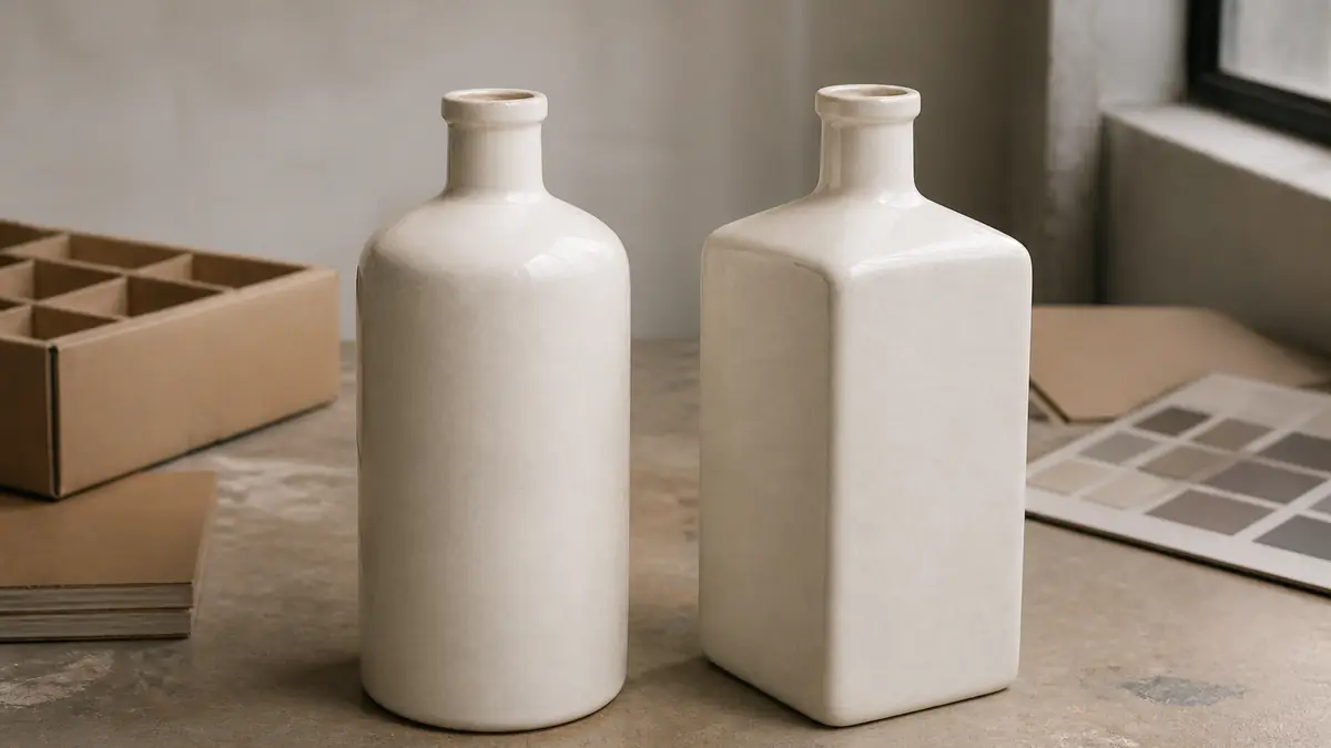
Choose a round ceramic tequila bottle when you want continuous decoration, flexible viewing angles, and a familiar hand feel; choose a square or softened-square bottle when you need defined artwork panels and a stronger front-facing silhouette. Neither shape is automatically stronger, cheaper, easier to ship, or more compliant. The best choice is the one that passes artwork, closure, filling-line, carton, and distribution checks as a complete package.
For most projects, a softened square is the practical middle ground: it creates a clear front panel without relying on sharp corners. A brand that depends on wraparound illustration may still benefit more from a round form. Use the comparison below to narrow the options before requesting physical samples.
Round vs. square ceramic tequila bottles at a glance
| Decision factor | Round bottle | Square or softened-square bottle |
|---|---|---|
| Brand presentation | Reads as continuous and approachable from several viewing angles | Creates an intentional front, dos, and side-panel hierarchy |
| Decoration planning | Well suited to repeating motifs and artwork that flows around the body | Broad panels can isolate a logo, story, or label; corners interrupt continuous artwork |
| Orientation | Often less dependent on one exact rotational position | Front-facing presentation may require more deliberate orientation |
| Hand feel | Continuous curves can feel familiar in the hand | Flats may provide a clear grip zone; edge radius must be assessed on a sample |
| Case planning | Requires a measured cell and divider layout around the actual diameter | May support compact rectangular layouts, but corner clearance and dividers still control the result |
| Best starting point | Story-led wraparound graphics or viewing from multiple directions | Front-label hierarchy, architectural branding, or controlled shelf orientation |
This is a screening comparison, not a performance guarantee. Wall profile, ceramic body, lustre, base, shoulder transition, bottle weight, fill level, closure, dividers, and handling route can change the outcome.
Start with the artwork system, not the outline alone
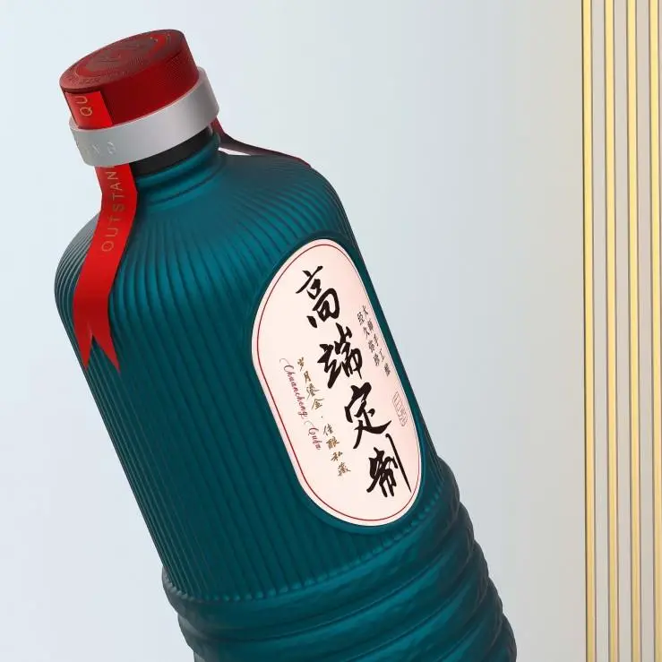
A round bottle gives artwork a continuous path. That can help a landscape illustration, repeating texture, or all-around ceramic decoration remain visible as the bottle turns. The trade-off is that a paper label or a large central mark sits on a curved surface, so the visible face at any one angle is narrower than the total decorated area.
A square bottle divides the story into panels. The front can carry the brand and tequila class, the back can hold regulatory or product information, and side panels can support secondary motifs. That hierarchy is useful when a buyer wants the bottle to face one direction on shelf. Cependant, a design that crosses a corner needs a deliberate transition; small text, thin rules, or a critical emblem should not be allowed to disappear around an edge.
Do not assume that a flat-looking ceramic panel is perfectly planar. Firing and glaze can introduce normal dimensional variation, so the artwork area, label construction, and application method should be validated on production-representative samples. Shang Art’s custom alcohol bottle with logo process is the right place to align the base shape with decoration, cap, and box requirements before production.
How shape affects tequila label planning
The bottle shape must leave enough usable space for the label information required in every destination market. Le Tequila Regulatory Council’s commercial-labeling guidance notes that tequila containers must carry legible Spanish information required by NOM-006-SCFI-2012 and that the information must be truthful and not misleading. Export labels may also need to satisfy the destination country.
For the United States, le TTB distilled-spirits label guidance explains placement requirements for mandatory information, including items that must appear in the same field of vision. A square panel can make a front-label hierarchy easier to visualize, but it does not create automatic compliance. A round bottle can also work when the artwork and visible field are planned correctly.
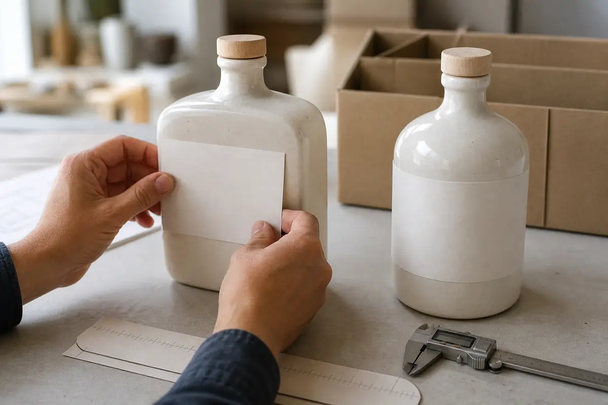
Before approving the mold or decoration, place the actual legal copy—at its intended size—on a dimensional drawing and a physical sample. Check every viewing angle, not only the front rendering. Leave tolerance for decoration registration and do not place mandatory information on a tight shoulder, corner transition, or strongly curved area unless the chosen process has been validated there.
Handling and pouring: judge the exact sample
Round bodies often provide a familiar grip because the hand meets a continuous curve. Square bodies offer flats that can help the user understand orientation, yet the comfort depends on width, depth, edge radius, bottle mass, et finition de surface. A large square body with a glossy glaze may feel very different from a narrow softened rectangle with a matte texture.
Evaluate the filled sample, not only the empty bottle. The liquid changes total mass and the balance during lifting and pouring. Ask reviewers with different hand sizes to lift the bottle from a shelf, rotate it to read the back, open it, and pour into a glass. Observe wrist angle, finger clearance, contact with corners, and whether the label or decoration sits in the natural grip zone.
The closure also belongs in this test. A sculptural body does not correct a neck-finish or stopper mismatch. Review suitable alcohol bottle cap and closure options, then test extraction force, resealing, tamper-evident components, and any shrink sleeve or neck decoration with the intended filled product and market requirements.
Case packing: square is not automatically more efficient
A square footprint may allow bottles to sit in a compact rectangular pattern, but that does not prove lower shipping volume. Ceramic shoulders may project beyond the body, corners may require clearance, and dividers must prevent bottle-to-bottle contact. A round bottle may use more space between body walls, yet a well-designed cell and pallet pattern can still perform efficiently.
Compare the package system using the same target fill, closure, decoration, case count, divider material, and pallet. Record at least:
- maximum bottle width and depth, including decoration;
- shoulder, base, and closure clearance inside each cell;
- bottle and filled-pack mass;
- divider contact points and corner protection;
- case dimensions, pallet pattern, overhang, and load stability;
- the actual transport route and handling method.
OIN 18602 frames optimization around the complete packaging system while preserving required functions. That is a better decision rule than calling one silhouette “sustainable” from shape alone. Verify the final design with a qualified packaging professional or laboratory.
Filling and decorating lines may favor different geometry
Round bottles can be convenient where containers rotate during inspection or decoration, while a square bottle may need controlled orientation to keep the front panel aligned. This is not a universal equipment rule. Guide rails, star wheels, infeed screws, labelers, sensors, accumulation tables, cap handling, and line speed all matter.
Send the filler and decorator a dimensioned sample before final approval. Confirm whether the line can:
- convey the bottle without rocking, jamming, or scuffing decorated surfaces;
- detect and orient the intended front panel;
- apply labels or decoration within the approved registration tolerance;
- fill without contaminating the decorated body;
- seat the selected closure consistently; et
- inspect an opaque ceramic container using the filler’s approved controls.
If the current equipment cannot orient a square bottle reliably, changing the shape, softening the corners, adding a stable base feature, or revising the decoration plan may be more practical than forcing the original concept.
Compliance and food-contact checks apply to both shapes
Round and square ceramic bottles can both be appropriate, but shape does not establish food-contact compliance. The finished ceramic body, internal surface, lustre, decoration, closure, and intended spirit must be reviewed for the destination market. Par exemple, EU Directive 84/500/EEC addresses possible lead and cadmium migration from ceramic articles intended to contact food. A supplier should not turn a bottle silhouette into a blanket safety claim.
Opaque or unusually shaped spirits containers may also trigger bottle-approval questions in some markets. In the United States, TTB provides separate labeling and bottle-approval resources. Confirm the current requirements with the responsible authority or qualified adviser before commercial production.
Use an A/B sample test before choosing
A useful comparison keeps the variables controlled. Request one round and one square or softened-square candidate with the same target fill, similar overall height, intended neck finish, representative glaze, and the real artwork. Then compare them in this order:
- Artwork: Apply the actual front, dos, and side information. Check legibility and corner transitions.
- Handling: Fill to the target level, close, lift, rotate, open, pour, and reseal.
- Line fit: Run representative samples through the planned filler, decorator, and packer where possible.
- Case fit: Build the actual divider and case; inspect clearance and contact points.
- Distribution: Choose a test plan that represents the real route. Le ISTA procedure overview distinguishes screening from general and route-specific simulation, so the protocol should match the shipment rather than be selected by name alone.
- Conformité: Confirm tequila labeling, destination-market labeling, food-contact documentation, and any bottle approval before the final order.
Record the result as a decision sheet: pass, revise, or reject for each factor. This prevents shelf appearance from overruling a serious filling, closure, carton, or compliance issue.
Which shape should your tequila brand choose?
Choose round when the design depends on wraparound artwork, multiple viewing angles, or a familiar curved grip. Choose square when the bottle needs a disciplined front panel, clear side stories, or an architectural shelf presence—and when the line can maintain orientation. Choose softened square when you want panel definition with gentler transitions for grip, decoration, and protective packing.
Browse Shang Art’s ceramic bottle capabilities and the real S22 TIME porcelain bottle for reference. When you are ready to compare two shapes, request a sample and customization plan with your target fill, artwork, closure, order quantity, filling-line information, destination markets, and shipping route.