

Modern vintage glass liquor bottles work best when they borrow a few recognizable historical cues and translate them into a controlled, manufacturable package. Start with the silhouette, shoulder, base, embossing, glass color, closure, and label hierarchy—but do not try to make every feature look old at once.
A new bottle can feel established without pretending to be an antique. The strongest designs use heritage as a visual language, then verify every detail against mold production, filling-line handling, label application, closure fit, packing, and the rules of the destination market.
What makes a liquor bottle look vintage?
There is no single “vintage bottle” shape. Historic containers vary by period, region, forming method, product, glassmaker, and closure. Le Society for Historical Archaeology’s historic bottle resource shows how specialists examine finishes, bases, seams, embossing, couleur, and other physical evidence when identifying older bottles.
For a modern spirits brand, those details are inspiration rather than proof of age. A vintage-inspired bottle is newly manufactured and should be described honestly. Its design may recall an apothecary flask, early machine-made whiskey bottle, ribbed decanter, squat spirits container, or engraved presentation bottle without copying a historical artifact or another brand.
Seven vintage design features that can be adapted
1. A recognizable silhouette
Silhouette delivers the first heritage signal. Rounded shoulders can feel familiar and utilitarian; a short body with a broad base can suggest an older decanter; a tall cylindrical form can recall apothecary or merchant bottles. The useful question is not whether the shape looks old in isolation, but whether it remains distinctive when viewed at shelf distance.
Keep the main proportions practical. Confirm overall height, maximum diameter, center of gravity, usable label panel, case layout, and the space required by the filling and closure equipment. An exaggerated shoulder or extremely narrow foot may look convincing in a sketch but create unnecessary contact or stability risks.
2. Shoulder ribs, panels, and restrained texture
Vertical ribs, shallow flutes, recessed panels, and geometric mold texture can create the irregular rhythm associated with older molded glass. These features also change reflections, grip, and the apparent depth of the liquid.
Texture should have a purpose and an approved boundary. Keep critical label areas flat enough for the chosen label stock, and review how ribs meet the shoulder, body, and base. Fine details that look strong in a rendering may soften during forming, while deep relief can affect glass distribution or create difficult inspection areas. The bottle producer should convert decorative intent into mold-ready geometry.
3. Gaufrage et débossage
Raised glass lettering, a shoulder medallion, a base mark, or a recessed panel can make a bottle feel permanent and crafted. Embossing is integrated into the formed glass through the mold; debossing creates a recessed design. Both require more than placing artwork on a 3D image.
Review letter height, stroke width, draft, relief depth, spacing, reading direction, mold seams, and the relationship with labels or direct printing. A small emblem on the shoulder or base may communicate more effectively than covering the entire body with relief.
4. Glass color with historical character
Amber, antique green, pale blue, smoky gray, and slightly warm clear glass can support a heritage direction. The color should still suit the liquid and brand system. It will appear deeper in thick corners and bases and lighter across flatter body sections.
Decide whether the color is within the glass or created by an exterior coating. The distinction affects sourcing, decoration, handling, and sample approval. The guide to liquor bottle colors explains how to compare visibility, artwork contrast, and coating flexibility without assuming universal performance from a visible shade.
5. A distinctive base or punt
A heavy-looking heel, recessed punt, stepped foot, base embossing, or deliberately narrow standing ring can create a strong vintage impression. The base is also where visual ambition can become structurally and commercially complicated.
Ask the manufacturer to review standing stability, glass distribution, internal geometry, total weight, capacity, contact points, and pack protection. A deep or sculpted base should be sampled and measured; it should not rely on the apparent depth shown in a rendering.
6. A closure that completes the period language
Natural-looking wood, cork, ceramic, métal, or a restrained bar-top profile can support a vintage bottle. Decorative wax, a neck band, embossing, or a small medallion may add another layer, but the closure must first match the bottle finish and sealing requirement.
A closure that is too ornate can compete with an embossed body. Conversely, a very plain cap can make a heavily detailed bottle feel unfinished. Review head diameter, height, opening grip, resealing, tamper evidence, and contact with the gift-box insert as part of one neck system.
7. Paper, typography, and decoration
Uncoated paper, deckled-looking edges, engraving-inspired illustration, restrained foil, one-color direct printing, and small label formats can create heritage character without changing the bottle mold. These are often useful when a brand wants a vintage direction on an existing bottle shape.
Do not sacrifice required information or readability for atmosphere. Fine lines, distressed effects, and small type should be tested at production size. Confirm label opacity, adhesive appearance, foil registration, abrasion, and contrast against the filled bottle.
Choose two or three primary heritage cues
Vintage design becomes less credible when every surface is distressed, embossed, coloré, waxed, foiled, and ornamented. A clearer hierarchy usually comes from selecting two or three main cues and allowing the remaining components to stay quiet.
Par exemple, combine a rounded flask silhouette with a small shoulder medallion and textured paper. Another direction might use amber glass, a simple bar-top closure, and a recessed label panel. A third could keep clear glass but use vertical fluting and a carefully designed base.
The broader production-ready alcohol bottle design guide can help align those choices with the liquid, closure, decoration, filling route, and secondary packaging before detailed artwork begins.
Stock bottle, adapted tooling, or fully custom mold?
| Development route | How vintage character is added | Main advantage | Main limitation to check |
|---|---|---|---|
| Existing bottle | Label, direct print, coating, closure, wax, medallion, or gift box | Begins with a proven bottle geometry | The silhouette and glass relief remain largely fixed |
| Adapted catalog design | Supplier-supported embossing, base plate, finish, or decoration changes | Can add proprietary detail without redesigning every feature | Available changes depend on existing tooling and technical compatibility |
| Fully custom bottle | New silhouette, proportions, texture, embossing, base, and neck specification | Greatest control over the complete form | Requires full engineering, tooling, sampling, validation, and commercial confirmation |
There is no universally best route. The right choice depends on how central the bottle shape is to recognition, what elements already exist in the brand system, and what development conditions the project can support. Shang Art’s glass bottle range provides starting forms that can be evaluated before deciding whether decoration or new tooling is necessary.
Translate historical inspiration into production geometry
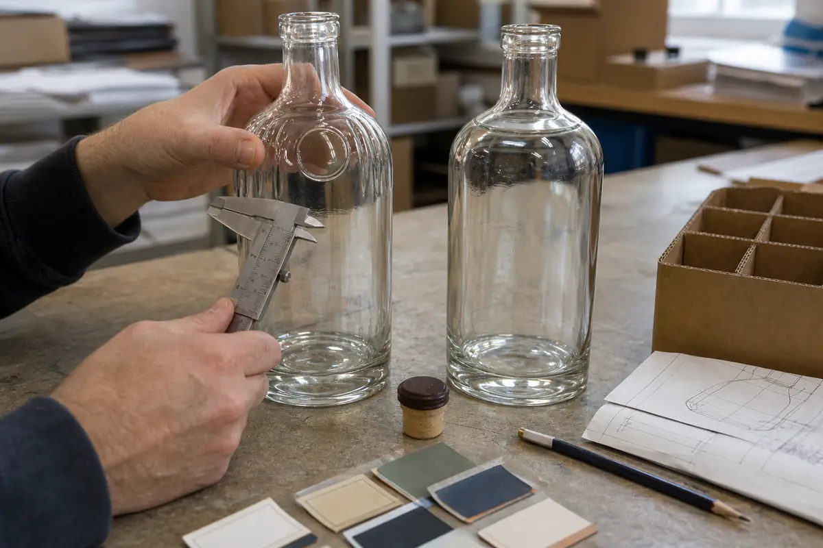
Begin with reference images that identify specific features instead of asking for a bottle that is simply “more vintage.” Mark the desired shoulder, body proportion, relief, base, cou, closure, and label relationship. Also identify what should not be copied.
The producer can then convert the concept into technical drawings and manufacturable surfaces. Review seam placement, draft, relief transitions, radius, base contact, capacity, overflow, closure finish, and line-clearance needs. Prototype reviews should compare the decorated sample with the plain reference under the same lighting.
Do not manufacture uncontrolled “imperfections”
Historic glass may show bubbles, waviness, tooling evidence, uneven thickness, or color variation. In an archaeological object, those characteristics can help explain how and when it was made. In a new commercial package, uncontrolled variation can also indicate a defect or interfere with inspection.
If a brand wants seed bubbles, optical distortion, hammered texture, irregular-looking embossing, or simulated patina, the effect needs a defined process and approved acceptance limits. Never assume that authentic-looking imperfection should bypass normal dimensional, visual, sealing, filling, or transport checks.
Review the bottle as a complete presentation

Le G19 glass bottle project demonstrates how the bottle, closure, label, serving moment, and presentation packaging contribute to the final impression. A heritage direction is strongest when those elements share a hierarchy rather than competing for attention.
Vintage-inspired bottle sample checklist
- Silhouette: inspect front, side, rear, and shelf-distance views with the intended fill.
- Dimensions and stability: confirm height, diameter, capacity, standing surface, center of gravity, and case fit.
- Relief detail: evaluate ribs, embossing, debossing, medallions, transitions, seams, and permitted variation.
- Label and print areas: test real stock, adhesive, opacity, registration, readability, and interaction with texture.
- Glass appearance: approve color, clarity, intentional optical effects, and visual limits under defined lighting.
- Closure system: verify neck finish, application, seal, opening, resealing, and tamper-evident requirements.
- Line contact: identify guides, grippers, conveyors, inspection zones, and points where relief may contact equipment.
- Pack protection: check dividers, inserts, top clearance, abrasion points, gift-box fit, and transport orientation.
- Market review: confirm capacity, label, bottle, and approval requirements for the destination before production.
- Approved reference: retain the signed sample, drawings, artwork version, components, and acceptance criteria.
Final recommendation
Use vintage design as a selective system of form, texture, couleur, closure, and print—not as a layer of artificial age. Choose a small number of heritage cues that support the brand story, translate them into modern production geometry, and approve the filled, decorated, closed, and packed sample under realistic conditions.
For authentic historical references, le Corning Museum of Glass collection provides thousands of documented glass objects spanning more than 3,500 years of material and design history.
To develop a vintage-inspired spirits bottle, review Shang Art’s custom bottle development process, then send the capacity, estimated quantity, target market, reference features, preferred bottle route, liquid appearance, closure, artwork, filling requirements, and presentation packaging through the project inquiry page. The team can help organize a practical bottle and decoration review before production details and commercial terms are confirmed.