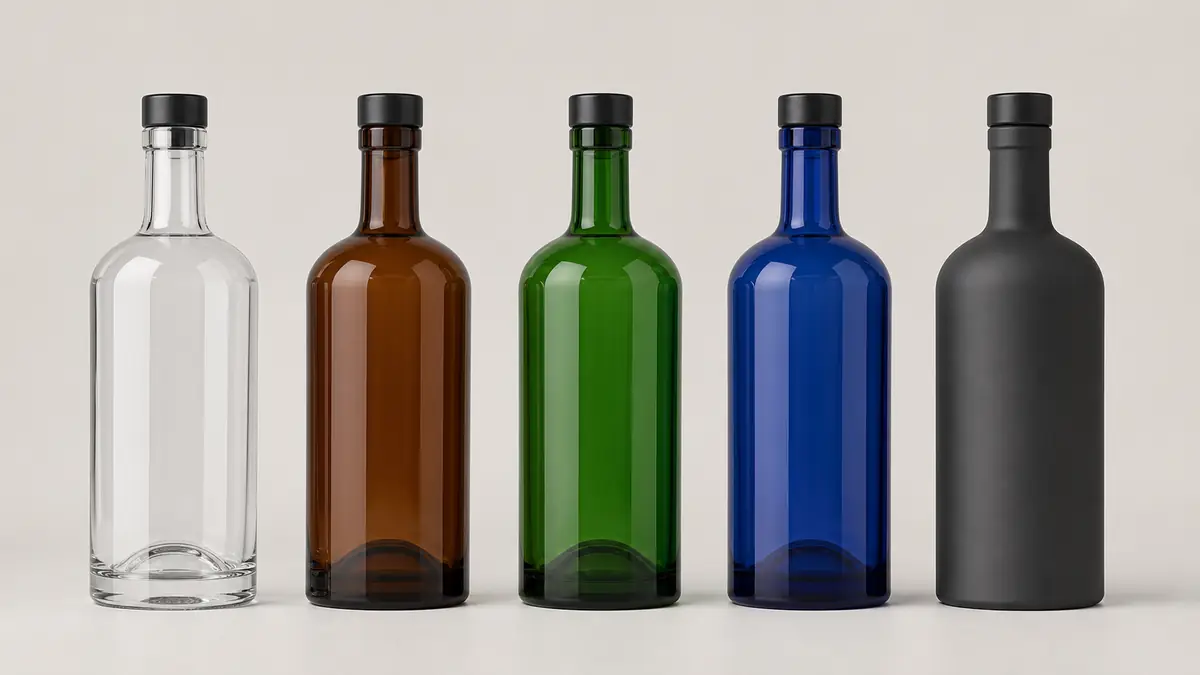
The best liquor bottle color depends on what the package must communicate. Choose clear glass when the liquid and bottle geometry should remain visible, amber or green when a traditional colored-glass character fits the brand, blue when a distinctive cool color is central to recognition, and an exterior coating when precise color, opacity, or multi-SKU flexibility matters most.
Those options are not merely different shades. Some alcohol bottle colors are created within the glass, while a coating is applied to the outside after the bottle is formed. That distinction affects sourcing, 艺术品, 处理, recycling conversations, and the way a production sample should be approved.
Liquor bottle colors compared at a glance
| Decision factor | 透明玻璃 | Amber glass | 绿玻璃 | Blue glass | Coated glass |
|---|---|---|---|---|---|
| Liquid visibility | Highest | Reduced, depending on depth | Reduced, depending on depth | Reduced and color-shifted | Ranges from transparent to fully opaque |
| How color is created | High-clarity or flint glass composition | Color within the glass | Color within the glass | Color within the glass or a supplier-specific color process | Exterior decorative layer after forming |
| Typical design role | Show the spirit and structure | Warm, established, substantial | Heritage, botanical, or distinctive | Cool, vivid brand recognition | Controlled brand color or special effect |
| Artwork concern | Back view and liquid can affect contrast | Dark background can mute some colors | Green background changes perceived artwork color | Blue background can compete with cool artwork | Adhesion, rub points, opacity, and finish consistency |
| Range flexibility | Differentiate with liquid, label, 关闭, or print | Strong base identity but fewer quick color changes | Strong base identity but fewer quick color changes | Distinctive but supplier availability must be confirmed | Useful for color-coded variants on one base bottle |
| Best first sample | Filled bottle with final label or direct print | Actual glass color with filled-product simulation | Actual glass color with filled-product simulation | Actual glass color under intended lighting | Fully decorated bottle with handling and pack checks |
The table is a selection guide, not a performance specification. Apparent color changes with glass composition, wall distribution, bottle geometry, lighting, liquid color, and production variation. If light transmission matters to the product, request data for the exact proposed glass and evaluate the filled package rather than assuming that every dark bottle provides the same protection.
Base glass color and exterior coating are different systems
清除, 琥珀色, 绿色的, and many blue bottles receive their visible character from the glass itself. Colorants and other ingredients are incorporated during glass production, or a supplier may use a feeder-color process for a particular run. The surface remains glass, although printing, 标签, 糖霜, or other decoration may be added later.
A coated bottle starts with a formed glass container and receives a thin exterior decorative layer. The coating may be transparent, translucent, or opaque, and it can be matte, gloss, gradient, metallic, or another supplier-supported effect. This route expands color freedom, but the coating becomes part of the decoration stack and must be evaluated with the label, ink, foil, closure equipment, dividers, and carton.
Frosting is another separate decision. It changes the surface toward a diffused, satin appearance but does not automatically mean a colored coating. The detailed comparison of 磨砂的, coated, and clear liquor bottles explains how to distinguish those finishes before requesting samples.
When is clear glass the right choice?
Clear glass works best when the spirit itself is a design asset. It allows buyers to see color, clarity, infusions, and the relationship between the liquid and bottle shape. A heavy base, sculpted shoulder, 压花, or internal punt can also remain visually prominent.
Transparency creates its own design work. A front label may reveal its adhesive, back printing, or rear label through the bottle. Light-colored inks can lose contrast against a bright liquid, while a pale spirit can make a white label appear softer than it did on a screen. Review the filled bottle from the front, side, and back under shelf lighting.
Choose clear glass when liquid visibility is essential, the package should look bright and precise, or the brand intends to differentiate through shape, 关闭, label, or direct decoration. Shang Art’s glass alcohol bottle range provides clear-base shapes that can be assessed before a color or finish is added.
When does amber glass make sense?
Amber glass brings a warm, grounded appearance that can suit whisky, rum, liqueur, and other products seeking an established or apothecary-inspired character. It can make a pale liquid appear darker and can visually reinforce caramel, wood, spice, or barrel-aging cues.
That warmth also changes artwork. Fine black details may lose separation on a dark background, and translucent inks can shift more than expected. Cream labels, opaque white underprints, metallic foils, and high-contrast closures are common starting points, but the final combination must be judged on the chosen bottle rather than inferred from a digital rendering.
Amber should not be selected on a universal protection claim. Color depth and spectral transmission vary. Ask the bottle supplier for relevant information and coordinate any product-stability testing required for the actual liquid, bottle, 关闭, storage, and distribution conditions.
What does green glass communicate?
Green glass can feel traditional, botanical, celebratory, or contemporary depending on the exact hue. Dark antique green and brighter emerald green do not create the same result. A green bottle can establish a strong family identity with relatively little decoration, but it also becomes a permanent part of every artwork color decision.
Warm metallics, cream papers, and opaque light inks often separate well from deep green, while thin blue or dark green elements may merge into the background. A filled sample is important because the liquid can deepen, warm, or mute the visible glass color.
Choose green when the hue supports the brand story across several years, not only a short campaign. Confirm the supplier’s available color reference, expected variation, bottle geometry, and the appearance of thick areas such as the base and corners.
When should a brand choose blue glass?
Blue glass creates immediate shelf recognition and can support clean, cool, maritime, modern, or night-oriented brand directions. It is especially useful when blue is a core brand asset rather than an accent that could be delivered more economically through a label or closure.
Availability deserves early attention. The exact cobalt, sapphire, or lighter blue imagined by a design team may not be standard for the preferred bottle shape or project volume. A stock blue bottle can provide a faster reference point, while a custom color route may involve different production conditions that must be quoted and confirmed.
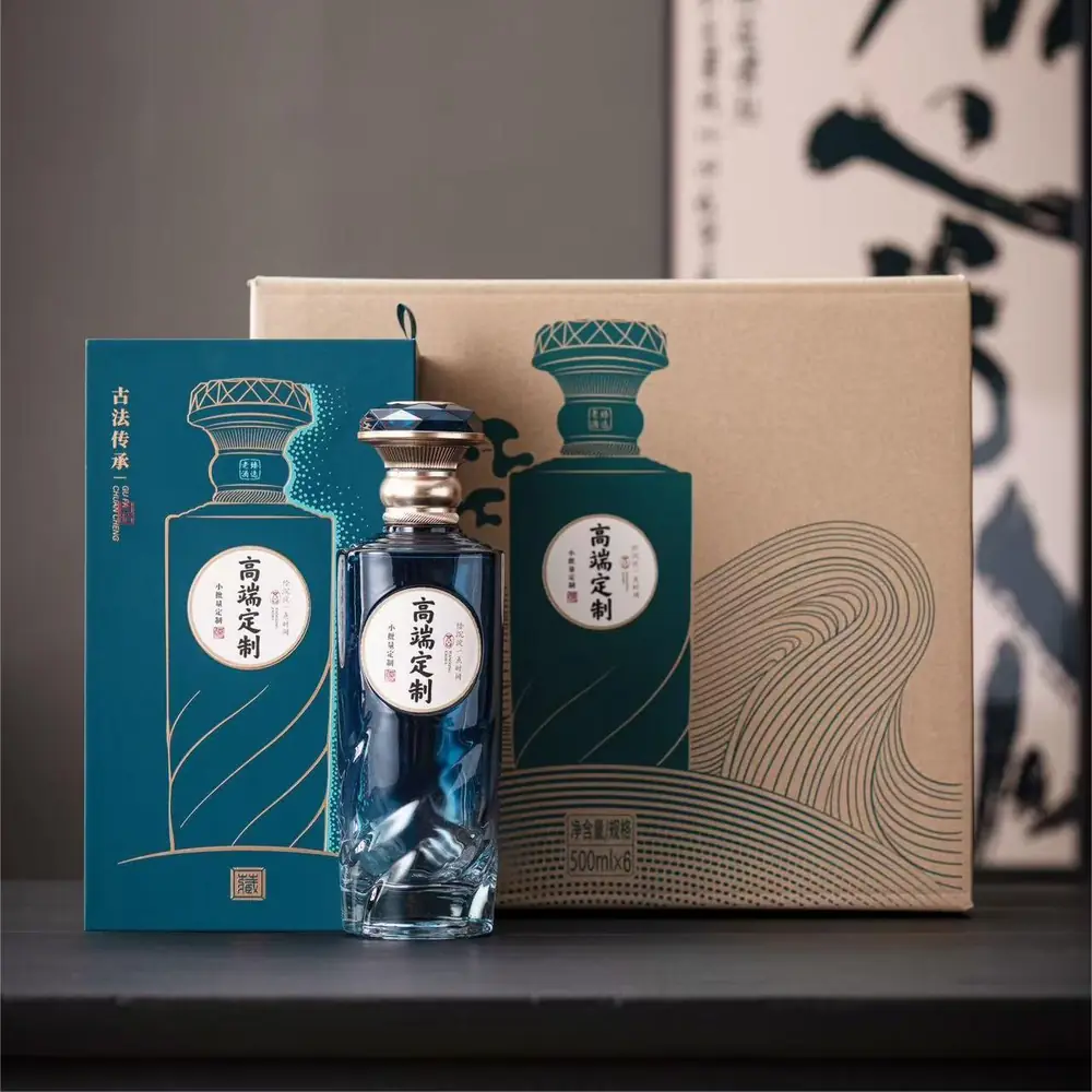
The G19 glass bottle project demonstrates why color should be reviewed as a complete package. The bottle tone, label, 关闭, and presentation box need to support one another instead of being approved as separate design elements.
When is a coating better than colored glass?
Coating is the more flexible option when the project needs a specific brand color, a fully opaque surface, a soft-touch or matte impression, a gradient, or several color-coded variants based on the same bottle shape. It can also reduce the need to source a different glass color for every SKU.
Flexibility introduces additional controls. The specification should define the color reference, gloss or matte level, opacity, coverage area, boundary position, permitted appearance variation, and any reserved clear window. Samples should be checked for adhesion, likely rub points, decoration compatibility, and contact with filling-line guides, closure equipment, trays, dividers, or cartons.
A coating should not be approved as an isolated color chip. It needs to be evaluated as part of the finished package, including all inks, foils, 标签, 关闭, and secondary packaging.
How bottle color changes labels and direct decoration
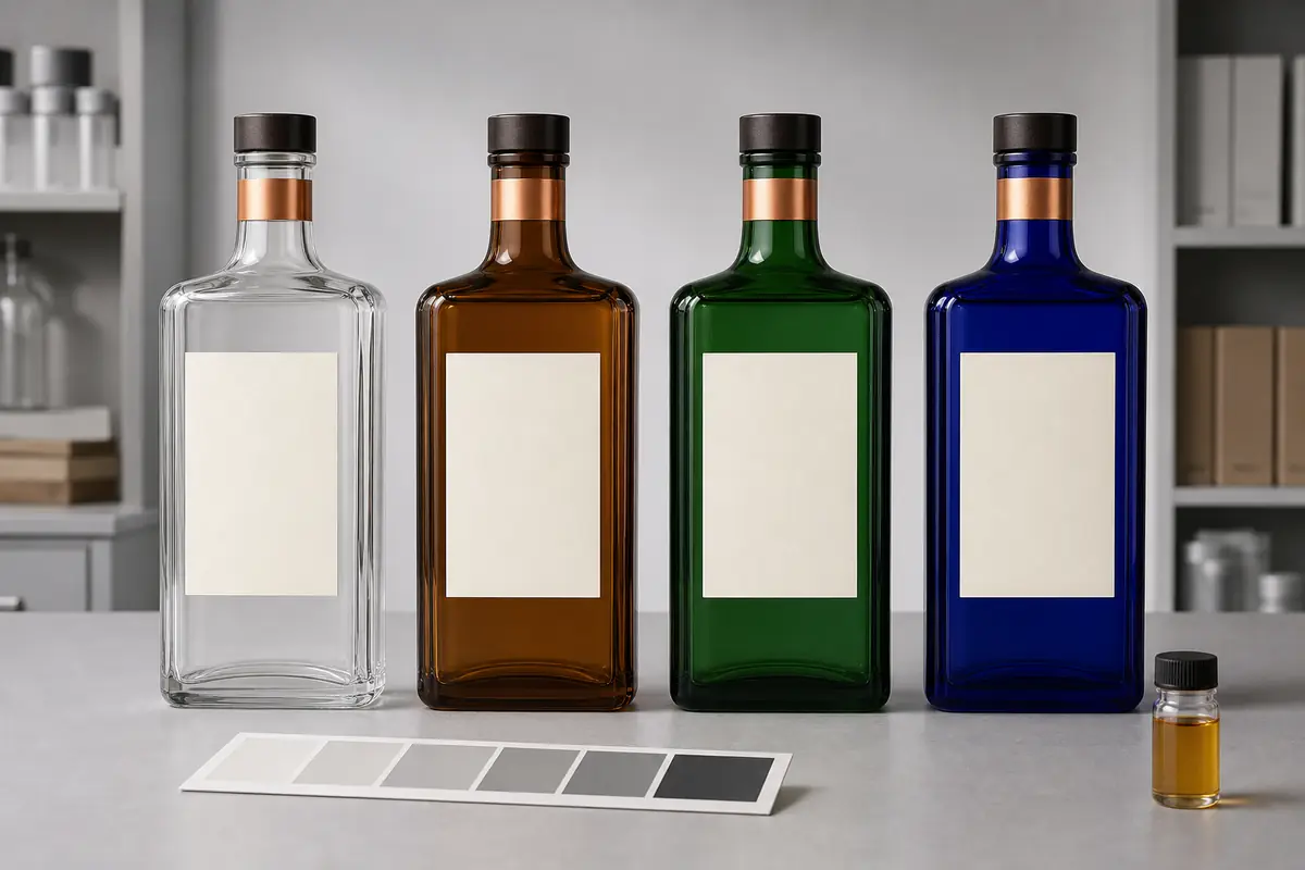
Review the same artwork on every shortlisted color. For a pressure-sensitive label, check paper or film opacity, adhesive appearance, edge lift, placement tolerance, and readability through the filled bottle. For direct printing, confirm the printable area, ink opacity, underprint requirements, curing sequence, registration, and minimum detail with the decorator.
Closures and accessories matter just as much. A black closure can make amber feel more serious, copper can warm green, and a pale closure can create sharp contrast on cobalt blue. Test the complete neck finish, tamper feature, collar, and label hierarchy together so the bottle does not become visually top-heavy or disconnected.
Does bottle color affect recycling decisions?
Container glass can move through closed-loop recycling systems, but color sorting matters. The FEVE explanation of glass color and recycling notes that colored cullet cannot simply be used to make clear glass and describes the role of separate color streams in Europe.
Actual collection, sorting, accepted decorations, and recycled-content availability vary by destination market, facility, and supplier. Ask partners about the relevant local system instead of making a universal environmental claim from bottle color alone. If a coating, sleeve, label, 关闭, or accessory is part of the package, review the complete component set with the responsible packaging and recycling guidance for the intended market.
A seven-step bottle color approval checklist
- Define the communication task. Decide whether the priority is to show the liquid, reinforce heritage, create color recognition, or support several SKUs.
- Identify the color system. Record whether the proposal is clear glass, colored glass, feeder color, or an exterior coating.
- Set a physical reference. Use an approved sample or agreed color standard and define the lighting used for evaluation.
- Review real geometry. Compare the body, shoulders, corners, neck, and heavy base because color depth will not appear uniform across every thickness.
- Simulate the fill. Evaluate the intended liquid color or a suitable controlled substitute, including front, back, and side views.
- Add the full decoration stack. Check labels, inks, foil, 压花, 糖霜, 关闭, collar, and secondary packaging together.
- Confirm project tests and acceptance. Agree on visual limits and any required light-transmission, adhesion, rub, filling-line, packing, or distribution checks before production approval.
Final recommendation
Start with the design task, not a favorite color. Clear glass is strongest when visibility leads; amber and green create integral warm or heritage character; blue offers distinctive cool recognition; and coating provides the broadest control over hue, opacity, and range architecture. The correct choice is the one that remains convincing when filled, decorated, closed, packed, and reviewed under realistic lighting.
Color decisions must leave enough room for mandatory information. The TTB mandatory distilled-spirits label guidance explains which statements must share a field of vision in the U.S. market.
To compare suitable options, review Shang Art’s custom bottle development process, then send the capacity, estimated quantity, target market, preferred bottle shape, color direction, liquid appearance, 艺术品, 关闭, and packing requirements through the project inquiry page. The team can help organize a practical bottle and color sample comparison before commercial terms and production details are confirmed.